Székesfehérvár city guide
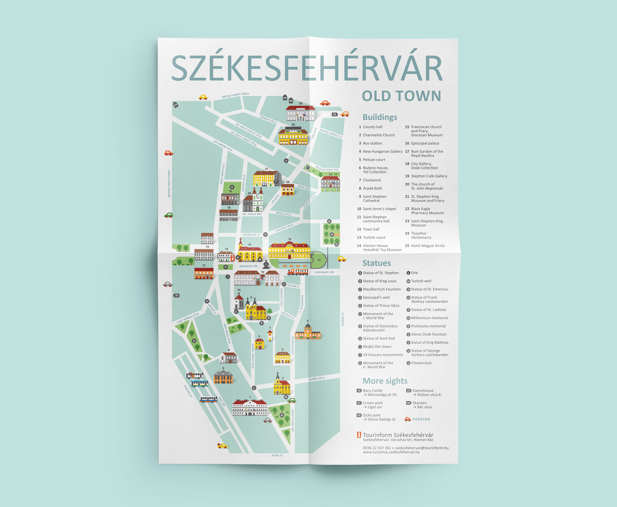
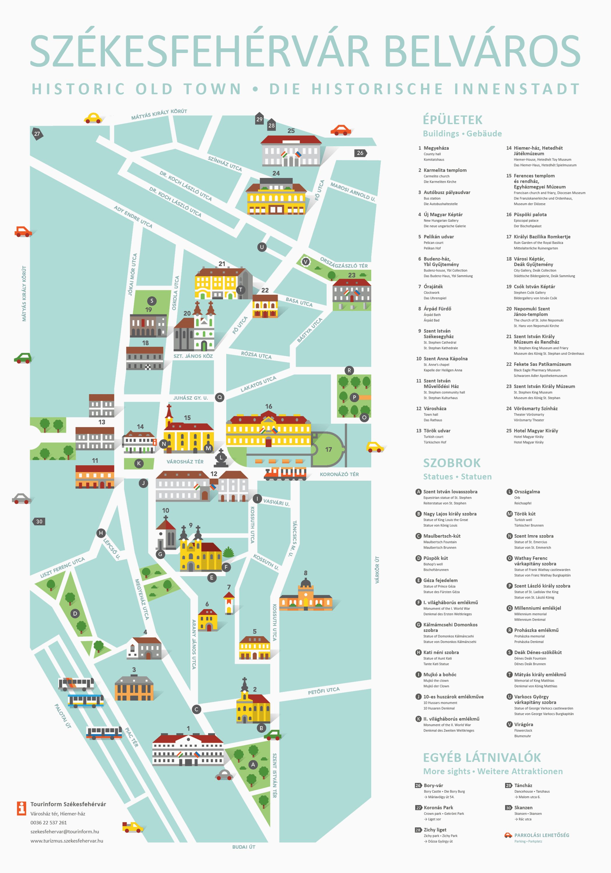
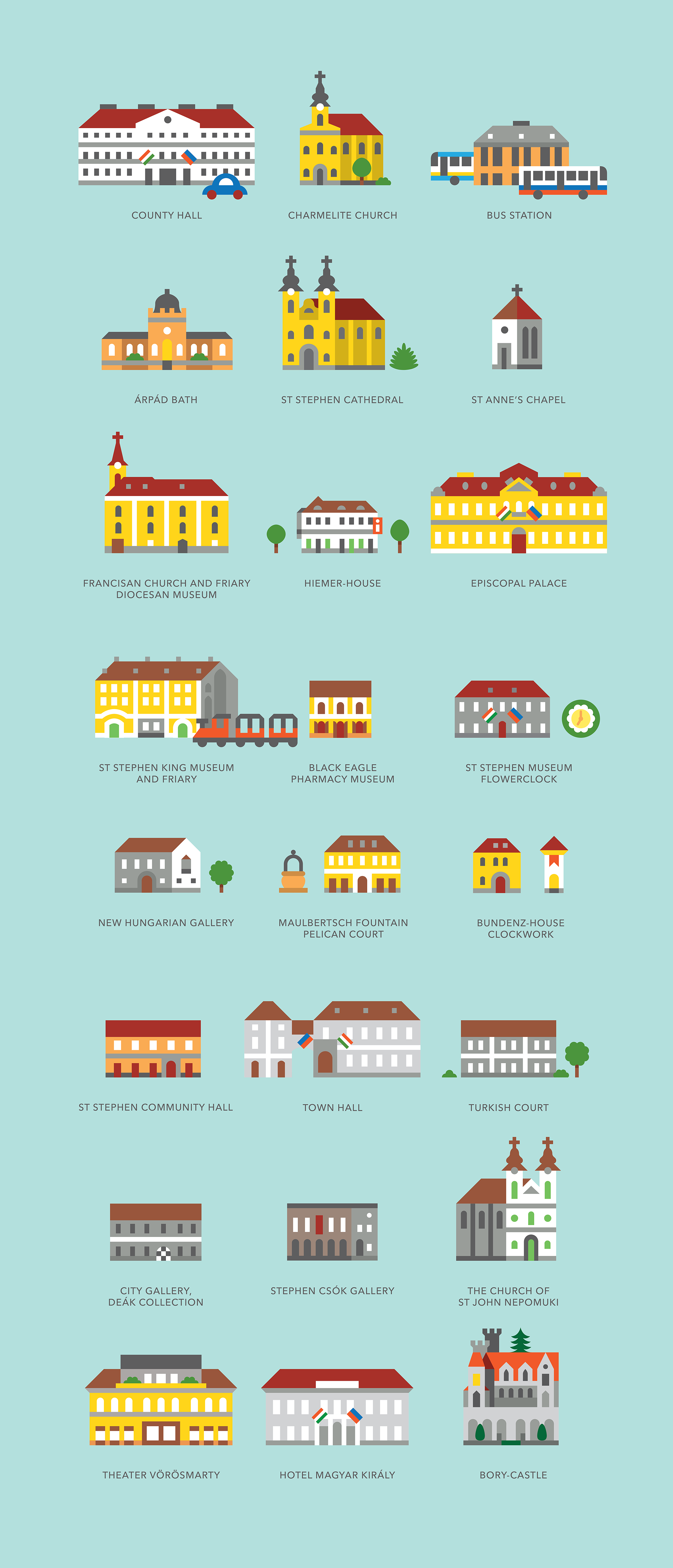
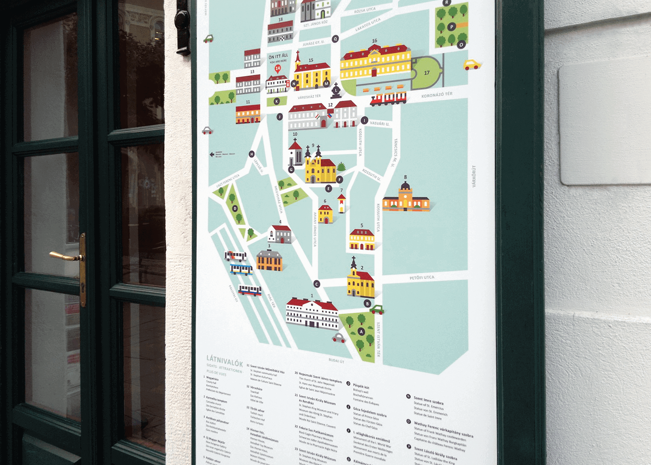
Map and icon set for the Tourist Information Office in Székesfehérvár
Bogi has been working on the visual identity (city guide and icon set) of Székesfehérvár’s tourist information. She loved working on this project, because Székesfehérvár is her hometown, and there is no other city that she knows so well. She doesn’t only know how the buildings look like, but also knows about their unique atmosphere, and the little things that make the city so special.
She redesigned a beautiful old style watercolour map, because the city has used it for a really long time. They asked for something fresh, easily understandable, and can be used flexibly. The brand’s main elements are the sights of the city, executed in a simple geometric style. The main purpose of the concept was that these sights can be used versatile, not only on maps, but on the shirts, pins, mugs, notebooks as well. If you would like to see one of our other map, check out our branding project for Prezent.
- Client \ Tourinform Székesfehérvár
- Art direction \ Halisten Studio
- Graphic design \ Bogi Nádi


